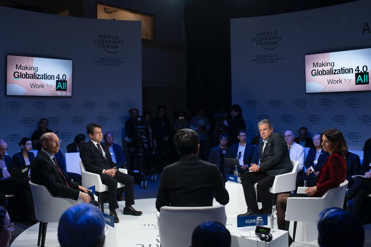


Environmental summits
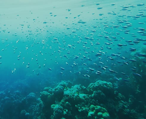
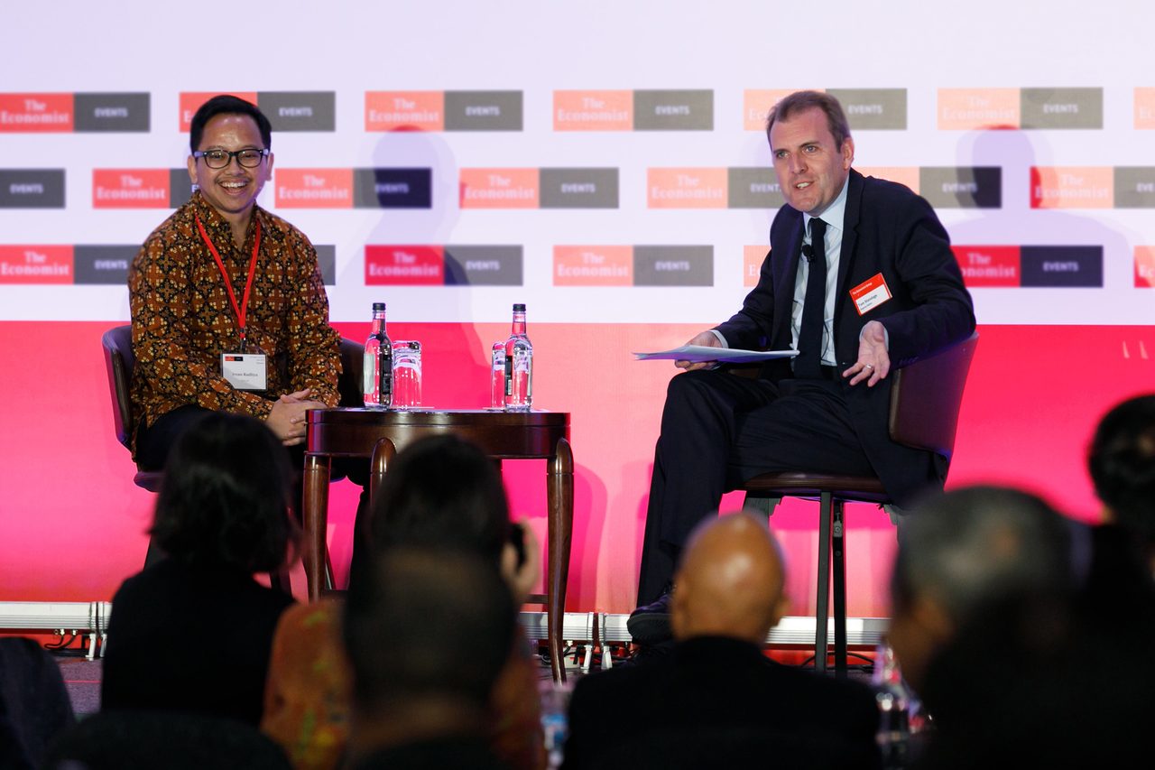
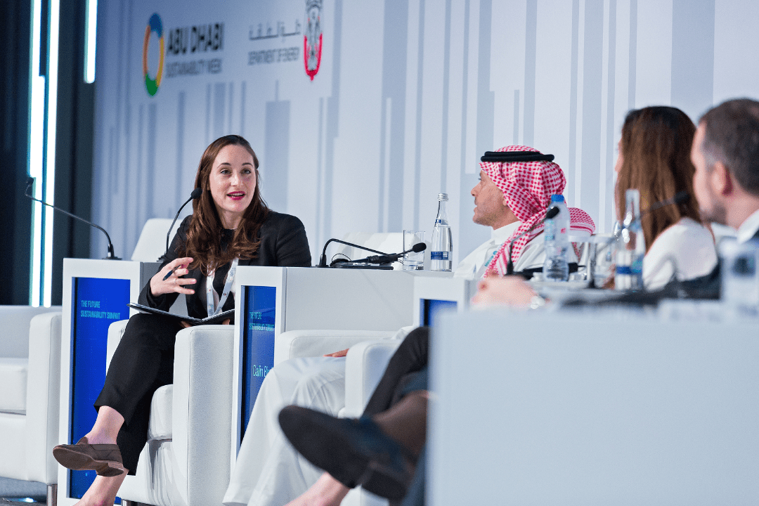
We hold annual summits on climate risk, sustainability and world oceans. These bring together leading scientists, politicians, NGOs and corporates to discuss the greatest issues facing our planet and steps to address them.
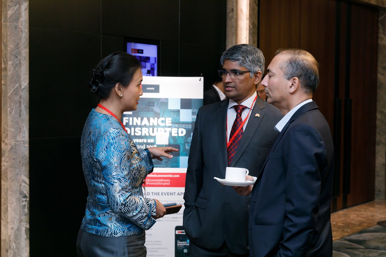
Global integrated research projects
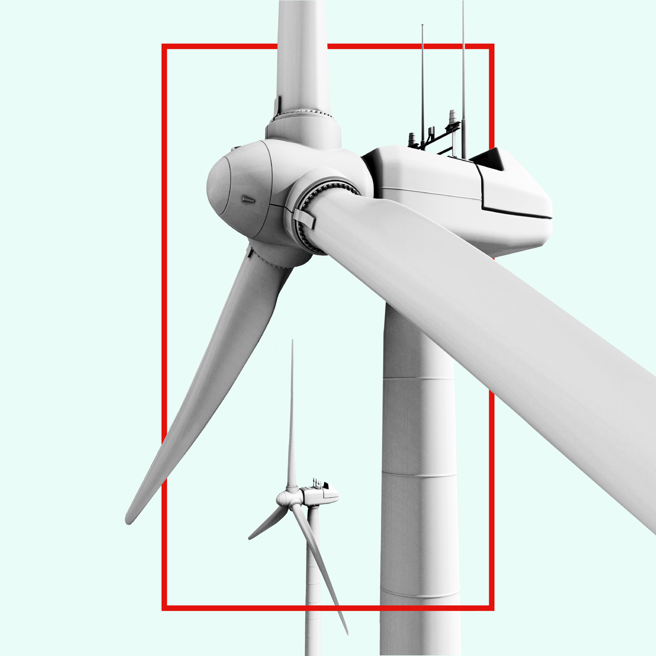
To facilitate progress globally we work across finance, governance and innovation to develop a series of integrated research programmes that explore sustainability’s most pressing issues. Recent research programs have focussed on sustainable economic systems, net zero and energy, resilience and adaptation and sustainable societies.
We hold annual summits on climate risk, sustainability and world oceans. These bring together leading scientists, politicians, NGOs and corporates to discuss the greatest issues facing our planet and steps to address them.
Global integrated research projects
To facilitate progress globally we work across finance, governance and innovation to develop a series of integrated research programmes that explore sustainability’s most pressing issues. Recent research programs have focussed on sustainable economic systems, net zero and energy, resilience and adaptation and sustainable societies.